
Middlesbrough FC have officially revealed their new club crest — a modern reimagining of the iconic 1986 badge — ahead of the Championship side’s 150th anniversary next season.
The refreshed design pays tribute to the club’s history and local roots while embracing a more contemporary look. Fans will see it featured on shirts from the start of the 2025/26 campaign, initially in a gold and red anniversary edition before returning permanently to the traditional red and white colours.
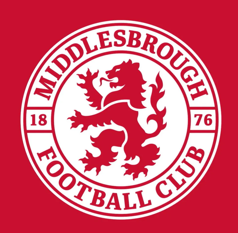
Designed by Teesside-based Boro fan Andy Pattison, with artwork from Joanne Grogan, the new crest incorporates several hidden nods to Middlesbrough’s heritage.
A Modern Take on a Classic Design
The redesign was inspired by the much-loved 1986 crest, following strong fan demand to return to a simpler, more traditional identity.
More than 4,000 supporters took part in a fan consultation, with feedback shaping every stage of the process.
Designer Andy Pattison described the project as the “pinnacle” of his career, saying:
“Hopefully what we’ve done is listen to the fans first and foremost. The feedback was that there was a lot of love for the 1986 crest.”
Hidden Details in the New Middlesbrough Badge
The new crest features several subtle nods to the club’s local landmarks and legacy:
- Red Lion: A refined version of the club’s iconic lion symbol.
- Roseberry Topping: Profiled between the lion’s mane and body.
- River Tees: Represented by the lion’s tongue.
- Ayresome Gates: Framing the special 150 years inscription.
- 1876: The club’s founding year appears split across the badge’s centre.
For the anniversary season, the badge will appear in gold and red, before reverting to red and white for future campaigns.
Club Reaction
Marketing manager Matt Barber called the unveiling “an exciting day” after an 18-month design process:
“Particularly with the club’s 150-year anniversary coming up, we felt like it was a good opportunity to do that.
It was led by fan demand, and the feedback we had from many was that they were keen for us to change going forward.”
Fan Reaction: “Chelsea… But Red”
The reveal has sparked mixed reactions among supporters online.
Some fans praised the return to tradition, calling the new badge “perfection”, while others compared it to Chelsea’s crest, joking:
“Did we seek permission from Chelsea before stealing their club crest?”
One excited fan wrote:
“We have never been more back — give me that in the centre of the home shirt next season and I’ll blow all my money on it.”
Others, however, were less convinced, calling the design “a let down.”

Leave a comment